Extraverage

ARTIST SPOTLIGHT


ARTIST PORTRAIT
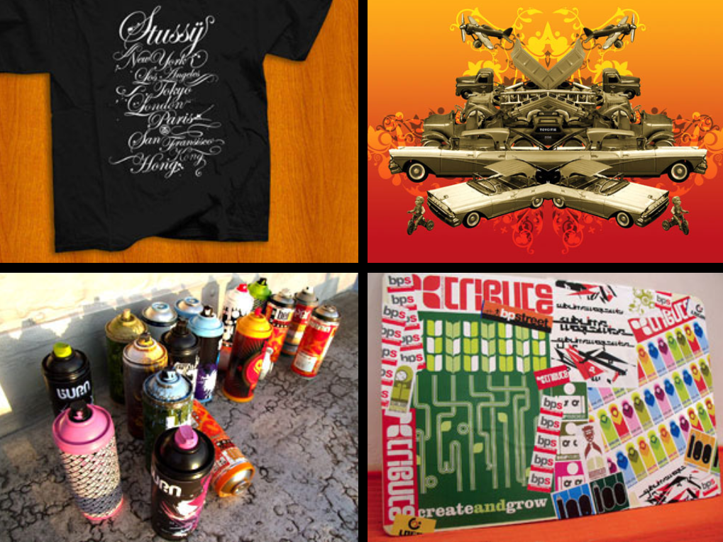
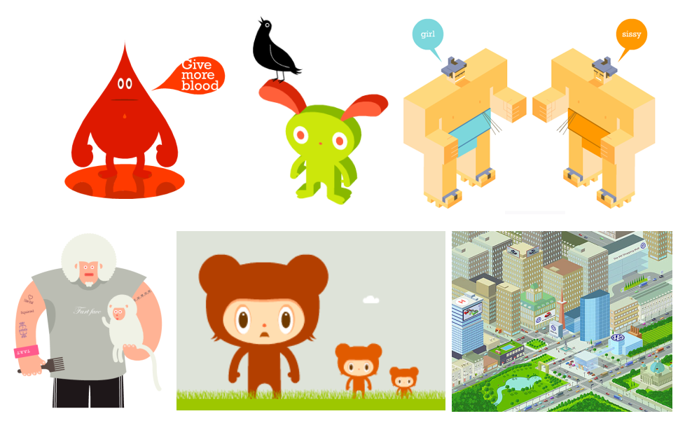
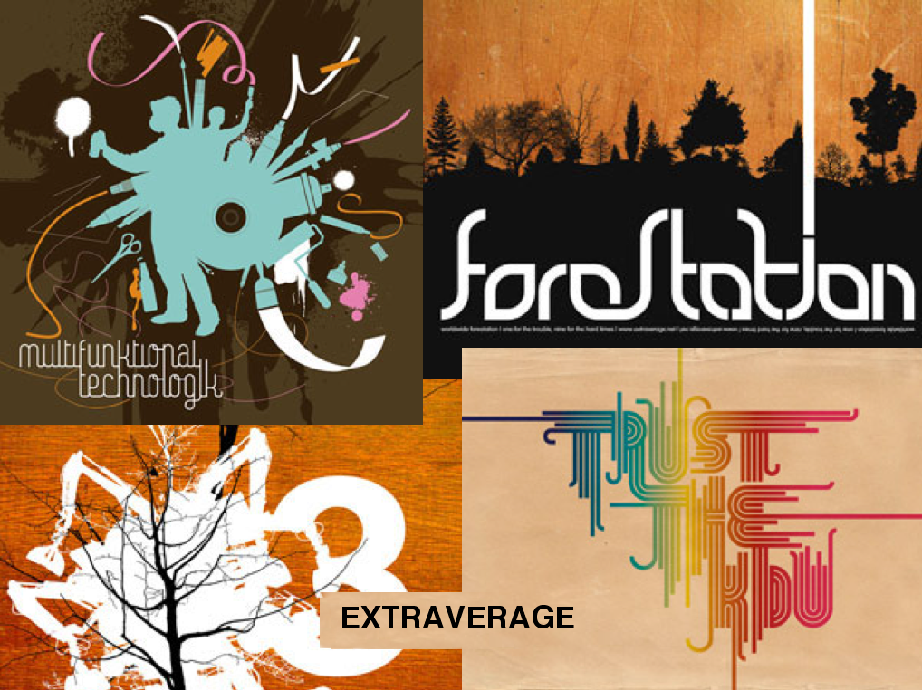
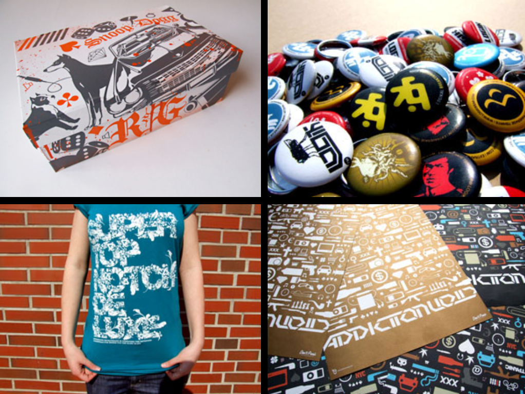
Karoly Kiralyfalvi has been involved in street-art since his teen years, “As a kid, I was always interested in visual arts, but the main influence came from my father, who was a painter, a poet and a sculptor. Pencils and markers were always my tools, until one day my father bought our first computer. Computer graphics have been my passion ever since”. As a teenager, Karoly became part of the local scene and under the name Extraverage, he made a name for himself. With his great skills, he mixes different styles and art languages in a powerful way. His work includes design for stickers, cans, clocks, magazines, books, posters, boards, tracksuits and t-shirts. Karoly is especially interested in design and images that stand on their own: bold, simple and strong!
Karoly is also the man behind projects like the World Wide Connections PDF Magazine and the Print4Street urban art gallery, and the founder of Drezign.hu, a community platform for Hungarian designers. Extraverage.net, his personal portfolio, features an extensive catalogue of his amazing graphics.


INTERVIEW

HOW LONG HAVE YOU BEEN WORKING AS A DESIGNER?
In high school I was already making illustrations for a course book. My first official job was in 2001, as a graphic designer and DTP editor of an urban lifestyle magazine. That was also the time I switched from analogue design to computers.

WHAT INSPIRES YOU?
The inspiration for my work comes from everyday life, like the city itself, friends, music (mainly from the 1997-2000 electronic scene from the UK), books, contemporary art, traveling, … I’m also very inspired by my father, who was a multi-disciplined artist.

WHAT'S YOUR ULTIMATE DREAM PROJECT AS AN ARTIST?
The greatest thing is to work for projects in the same scene I'm interested in. For example working for brands that support the underground music scene, urban artists, and things like these.
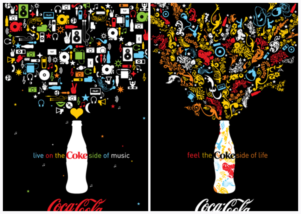
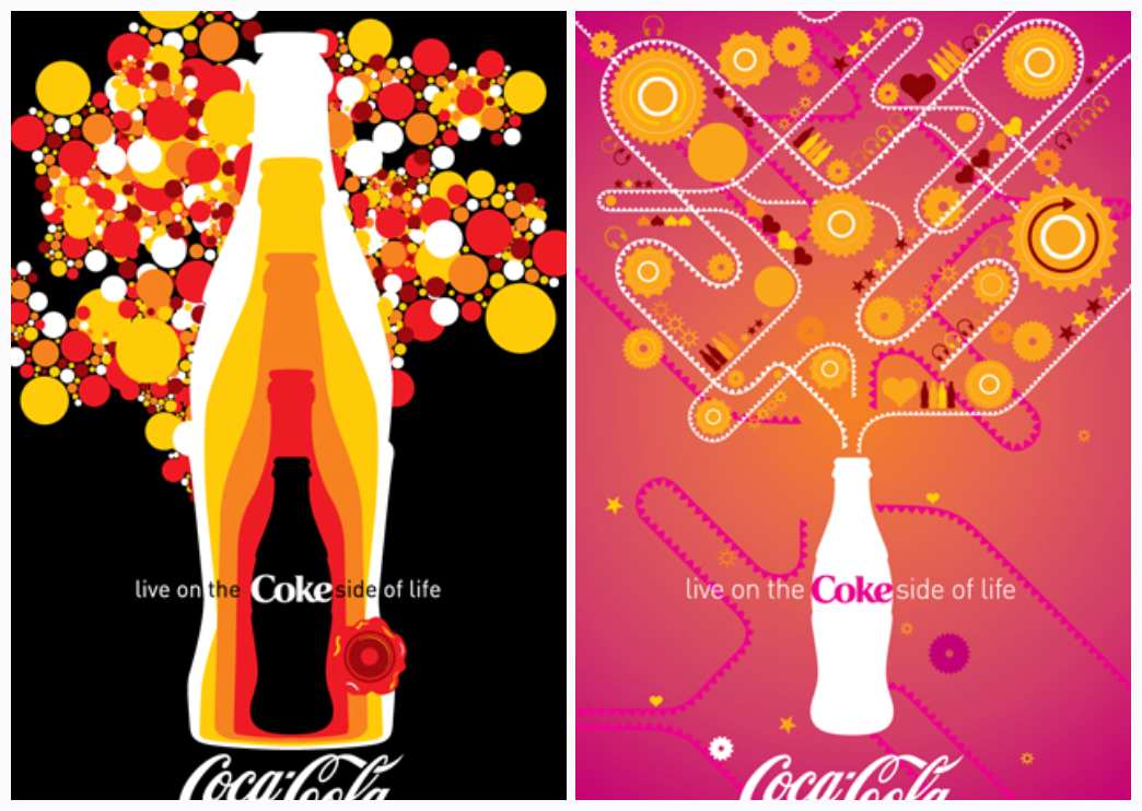
Another nice example is of course a global collaboration project with great designers around the world, like the current Remix Project for ‘Coke’. It's always really interesting to see the end results.


HOW DID THE ‘COCA-COLA’ HISTORY AND THEMES INFLUENCE YOUR REMIX WORK?
I tried consciously to use the warm ‘Coca-Cola’ colours, and to focus on positive feelings and shapes in the graphics. The aim was to create something happy and fresh, in line with the iconic ‘Coca-Cola’ images.

WHAT INTERESTS YOU MOST IN ‘THE COKE SIDE OF LIFE’ REMIX PROJECT?
Actually the basic idea of the Remix Project: give a blank canvas to an artist and let him work around a theme. The briefing gave us endless possibilities to experiment. This liberty was the biggest inspiration.

WHAT WAS YOUR FIRST IDEA IN RELATION TO THE “YES IN THE FACE OF NO” THEME?
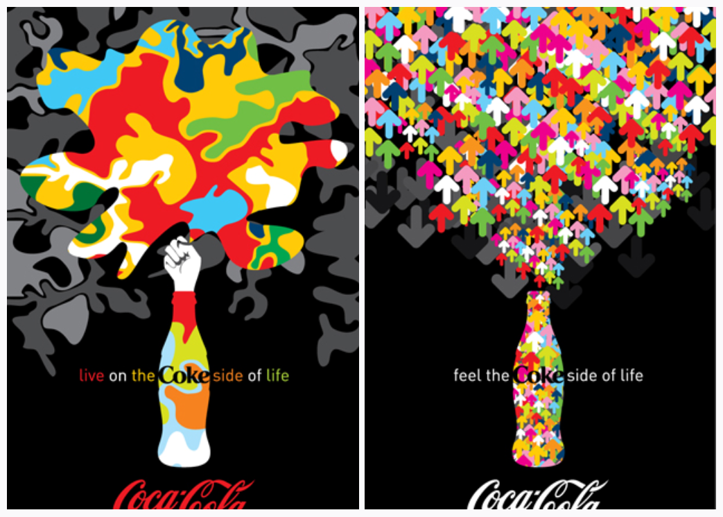
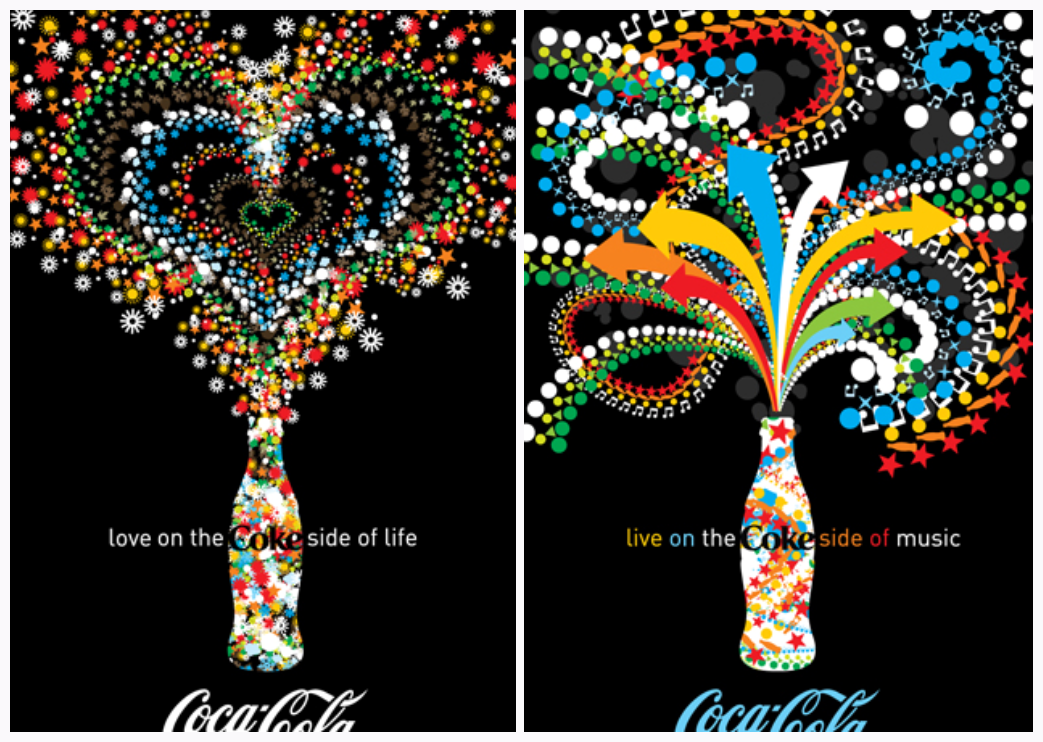
The “Yes in the face of No” was quite hard to handle, my first feeling was to show the impact of the ‘yes’ and the ‘no’. The ‘yes’ is colourful and positive, and fights with ‘no’ in a friendly way. Of course you always hope that the ‘yes’ will win…


DID IT TAKE LONG TO FIND YOUR PERSONAL STYLE?
It took long years, and the reason is that I'm always open to new things; always trying to create fresh versions of my artworks, trying new directions. Nowadays, I feel there's a style I'm recognizable for...

CAN YOU SHARE ANY INSIGHTS IN YOUR CREATIVE PROCESS?
Ninety percent of my graphic works is planned in my head first and then realized with computer. The basic shapes and the main impulse of each job is based on my experience and style. Then you have to mix concept & style correctly.

WHERE CAN WE FIND YOU WHEN YOU'RE NOT WORKING?
Actually in front of my computer, working on personal projects. Or somewhere in the streets, riding a bike. In luckier cases, I'm abroad!

HOW WOULD YOU DESCRIBE YOUR STYLE?
Always simple, pure and fresh.


Ten Pin Magic

Ancient Egyptians began bowling in about 5200 B.C. German and British people also enjoyed the game, but it was the Dutch settlers who brought their version of "Dutch pins" to America in the 16th century. They played their games in the middle of Manhattan, which is still sometimes referred to as the "Bowling Green." Originally a nine-pin game, bowling in New York attracted some shady characters and was eventually outlawed; in order to get around the gambling laws that prohibited it, alley owners simply added another pin. And the rest is history.

Lumbered with the Fred Flintstone image for years, tenpin bowling has recently found a retro-cool status among the young and the fashionable.
If you travel to Atlanta, hometown of ‘Coca-Cola’, you should check out the new Ten Pin Alley in Atlantic Station. The place is owned by cool cats Ashton Kutcher and Wilmer Valderrama, servers wear vintage-inspired bowling shirts and the dj plays very groovy tunes. So 'pick a cherry' and 'hammer the pocket'. Fabulous atmosphere and a guaranteed good time!

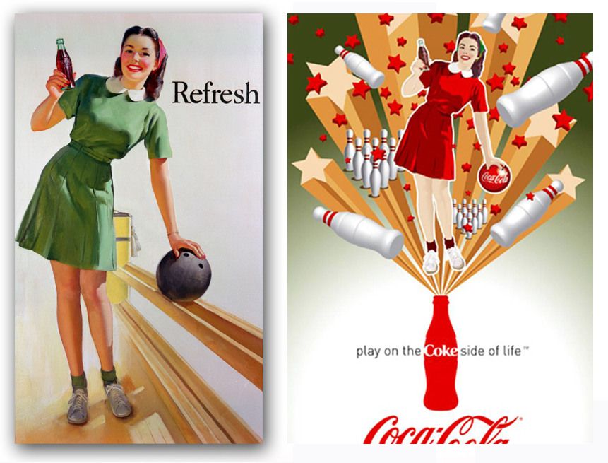
For all the bowlin' lovers out there: here you can see an original ‘Coca-Cola’ poster from the forties plus the Remix version. Enjoy!

Be Really Refreshed

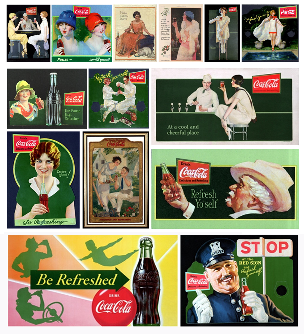
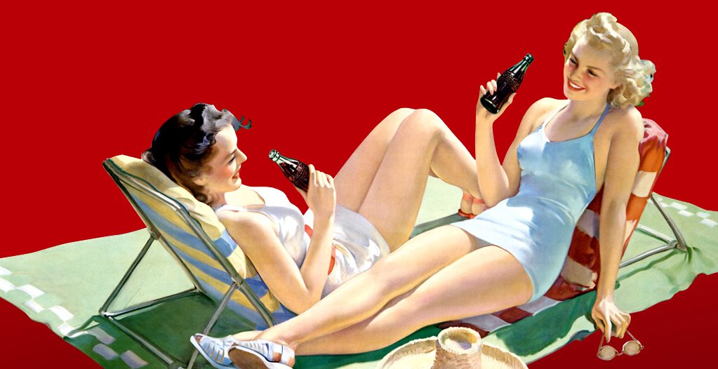
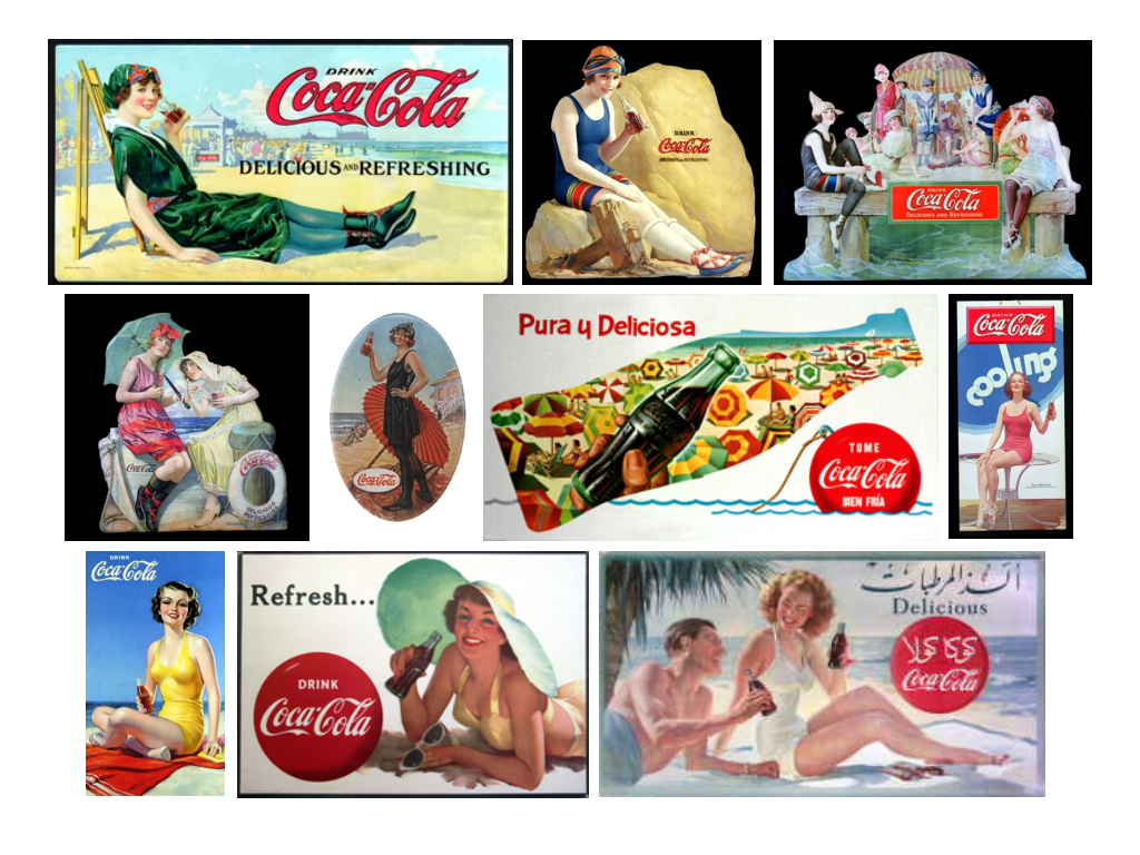
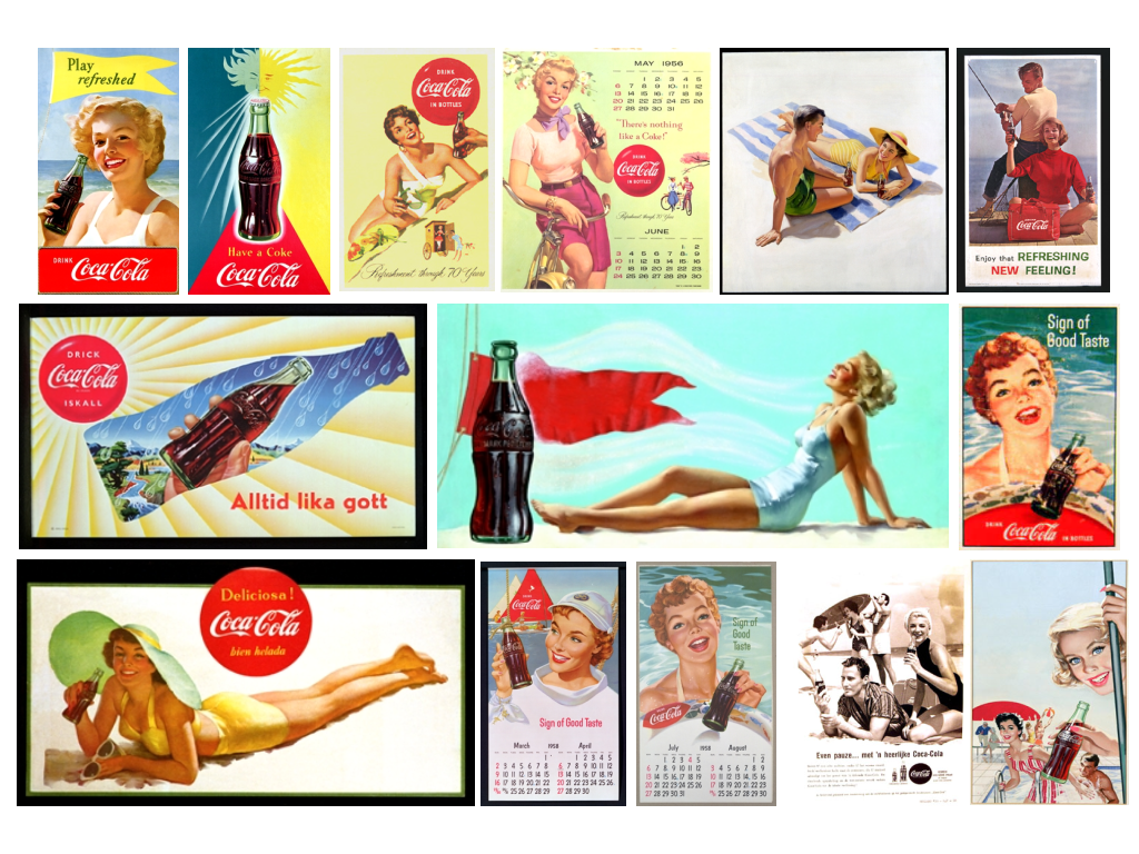
“Here’s the way to feel refreshed” was a slogan that caught the eye from magazine readers in the 1940s. “Your thirst takes wings when you treat it with to an ice-cold Coca-Cola”. Even the busiest man in the world comes up smiling after ‘the pause that refreshes’.

From the earliest days, ‘Coca-Cola’ has a very simple purpose, and that is to offer people of the world a moment out of the day to relax, to enjoy and to be refreshed.

The feeling when you drink an ice-cold ‘Coke’ from that traditional curvy glass bottle on a steamy hot day is one of those things you never forget or fail to appreciate. Your whole body relaxes as that caramel-like sweetness hits your tongue and is followed by that wonderfully pleasant burn as it hits the back of your throat and is finally welcomed by your stomach as it quenches your thirst. That, my friends, is refreshment!

Here you can see some amazing images from those early days...

Idokungfoo

ARTIST SPOTLIGHT


ARTIST PORTRAIT
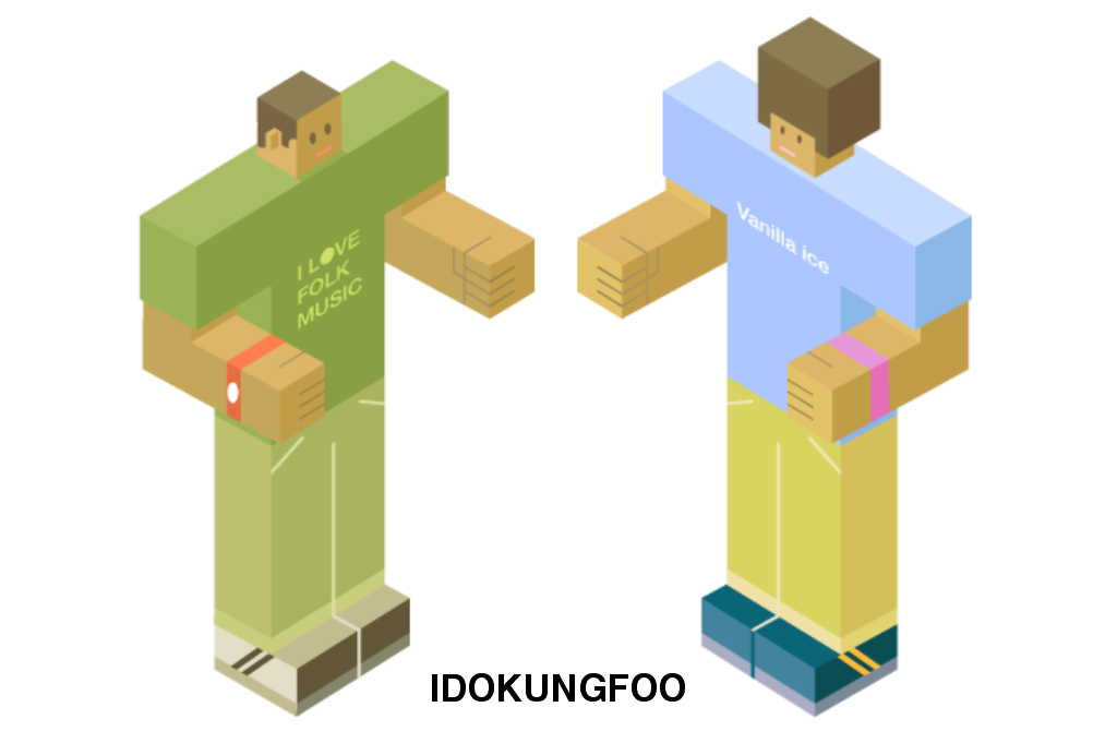
Illustrator and designer Simon Oxley lives and operates from his wife’s hometown of Fukuoka, Japan. From 1986 to 1989 Oxley attended college in the UK, studying graphic design, photography, drawing and typography – a solid basis for what he has been doing as a job ever since. In the early 90s he spent a lot of time making pseudo artistic paintings hoping these would become the next big thing and appear in the best galleries worldwide. Sadly, this was not the case and Oxley ended up giving them to friends as Christmas and birthday presents - lucky people!
In 1997 Oxley moved to Japan to work in a design company based in Harajuku. Since 2002, Oxley has run his own design and illustration studio, Idokungfoo, and works for clients from all over the world. His future goals include writing stories which he can illustrate with his famous characters / producing films which include original scores produced by simple means (amateur sound recording equipment and the help of friends) / making new merchandise which features his images / opening a store which offers all Idokungfoo products and all the other things he likes.


INTERVIEW


HOW LONG HAVE YOU BEEN WORKING AS A DESIGNER?
Since 1989, when I left Graphic design college and found employment at a computer game production company – I designed and artworked the cassette inserts.

DID IT TAKE LONG TO FIND YOUR PERSONAL STYLE?
My personal style changes with the weather. Like many image makers, I am often unhappy with images I made more than 3 or 4 months ago. I appreciate the importance of achieving a unique style in commercial terms – but I am unsure whether I have arrived just yet… It seems to be always work in progress…

WHAT INSPIRES YOU?
This is basically something I cannot pin down to one thing….

WHAT'S YOUR ULTIMATE DREAM PROJECT AS AN ARTIST?
It is my goal to own a shop someday, selling strange curiosities which appeal to all ages.

HOW DID YOU COME UP WITH THE IDEAS BEHIND YOUR ‘‘COKE’ SIDE OF LIFE’ REMIX POSTERS?
I like to work spontaneously – so just see what happens as I draw. A shape will evoke a direction, as will a word or phrase. I spend a lot of time writing phrases which come to mind – these help to create a story line to guide the visual direction I take.

HOW DID THE ‘COCA-COLA’ HISTORY AND THEMES INFLUENCE YOUR REMIX WORK?
Being 38yrs old I can recall many ‘Coke’ campaigns – Coca Cola is an iconic part of many cultures. I chose the Christmas theme instantly, since I felt my imagery would work best with this festive theme. I also remembered that the common image we have of Santa Claus in the red costume originated from the early ‘Coke’ campaigns – which I still find extraordinary!

CAN YOU GIVE SOME BACKGROUND INFORMATION ON YOUR FAVOURITE REMIX ARTWORK?
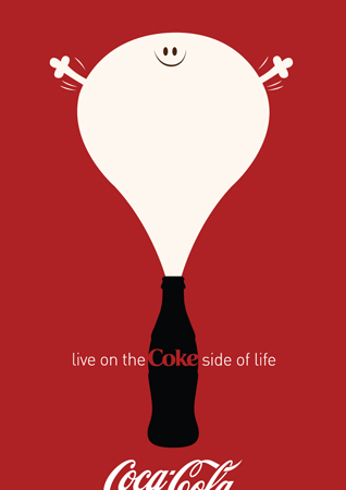
The large bubble character blowing up out of the top of the bottle is my personal favorite. Maybe it's the simplicity of form – or just the innocent expression of fun which I like to think ‘Coke’ pursues.


WHERE CAN WE FIND YOU WHEN YOU'RE NOT WORKING?
My wife and I have two young sons, so much of my time is spent playing with them – seeking out natural and cool locations in the mountains or shopping in malls on rainy days. Illustration is not really work for me, I often draw with the children, teaching them at the same time. I also spend a lot of time producing photographic and vector imagery for iStockphoto.com picture library.

WHAT WAS YOUR FIRST IDEA FOR THE INTRINSICS POSTERS YOU DESIGNED FOR ‘COCA-COLA’?
I wanted to make something simple visually – not clutter the space too heavily and risk producing a wallpaper pattern in the triangular area made available above the iconic bottle silhouette.

WHAT WOULD YOU LIKE TO ACCOMPLISH AS A DESIGNER?
I would like to make people feel happy, laugh, become curious, question everything they believe, discover renewed enthusiasm for life and generally feel encouraged by a sense of variety which the world has to offer us.

ANY INSIGHTS IN YOUR CREATIVE PROCESS?
Keep thinking and recording thoughts however obscure. Many times an apparently weak idea can work depending upon the method of interpretation. Also, I find it important to take breaks: stay away from computers for a few days sometimes, wander around a fish market, go to the countryside and watch people ploughing fields… basically remove myself from my cozy bubble.

DO YOU START SKETCHING ON PAPER OR DO YOU WORK DIRECTLY ON THE COMPUTER?
I enjoy sketching and brush and ink painting – but only occasionally I scan these in to work from. It is true that the hand drawn line contains way more character than a computer stroke, although the computer stroke has its own personality which I like also. It is easy to manipulate parts of an image to create a result which is not preconceived.


YOUR IMAGERY SEEMS LIKE TO TELL A STORY EACH TIME. DO YOU HAVE THE STORY IN YOUR HEAD FIRST OR DOES IT COME GRADUALLY WHEN YOU START ILLUSTRATING?
I treat all my images as frames in a storyline, but I enjoy the moment before something is about to happen – or an ordinary moment which people may be surprised to find illuminated. I try really hard to empty my head of the piles of past visuals I have buzzing around, trying to influence the story I am making. This is the hard part.

IF THERE WAS AN IDEAL IDOKUNGFOO WORLD, HOW WOULD IT LOOK LIKE?
It would be a world covered in fake fur so no-one would get grazed knees ever again falling on concrete. There would be large shiny animated statues of characters everywhere which everyone could climb on, through and over.
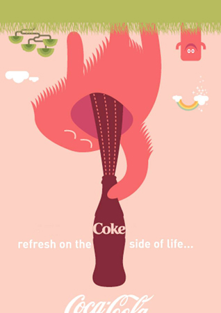
Large shopping malls would be leveled to make way for traditional high streets with shops and businesses specializing in one of a kind quality hand made characters and designer goods. And everyone would drink 'Coca-Cola' upside down... ;-)

Summer Day

It's a beautiful summer day. An incredible blue sky, the sun is shining. Like Bob Marley sang: "The weather is sweet, yeah, make you wanna move your dancing feet". Celebrate! Dance on a table, play frisbee, make ice cream, eat watermelon, drink an ice-cold ‘Coca-Cola’, run through a sprinkler, walk through the grass barefoot, blow a dandelion, smile at a stranger, twirl until you're dizzy, catch a firefly, splash in a creek...
Enjoy this most glorious of seasons. Hmmmm!


Action Girl

COCA-COLA CARDBOARD
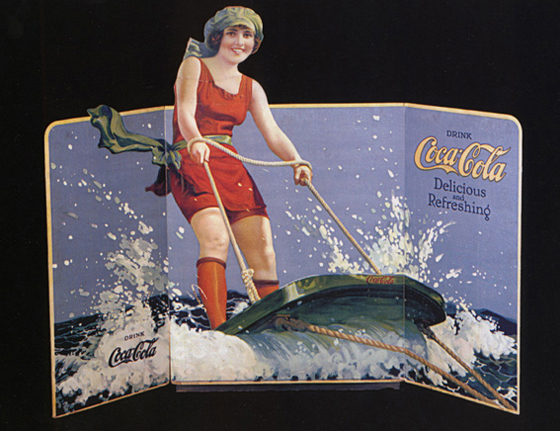
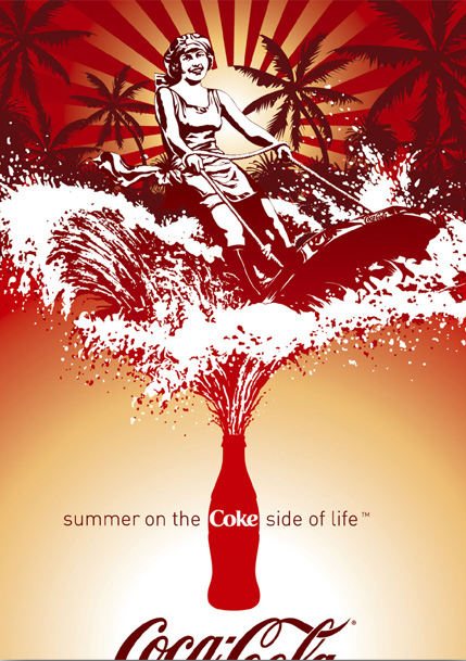
Check out this amazing ‘Coca-Cola’ cardboard from 1923 showing a 'water ski' girl avant la lettre. This sport was a little-known activity in those days, and the material was still very primitive. The water ski racers just rigged a clothesline up to a boat, and enjoyed the refreshing ride.


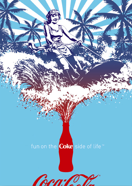
'COKE SIDE OF LIFE' REMIX VERSION
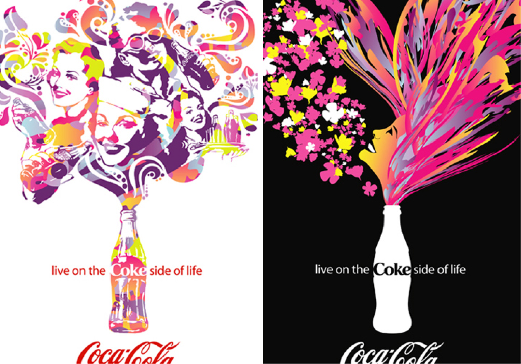
Here you can see the 'Coke Side of Life' Remix versions by Caos CC & RockAndRoll Agency. Life can be beautiful...


Serge Mienandi

ARTIST SPOTLIGHT


ARTIST PORTRAIT
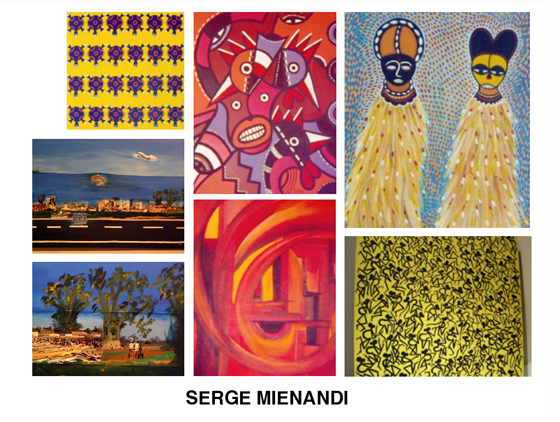
Serge Mienandi was born in 1967 in Brazzaville, Congo. He studied art in the famous Poto-Poto School of Painting in his hometown.
Since its establishment in 1951, this school has been a vital location for the creation, exhibition and sale of African paintings. The school has often been described by critics as historically important and very significant in terms of longevity and widespread influence. The idea of the Poto-Poto School is to save the essential spirit of African art and adapt it to modern life. Inspiration comes from local legends and traditions mixed with today’s reality. Mienandi’s artworks depict village and market scenes of drumming, hunting, dancing and masquerade performances. But he brings also modern subjects as urban culture, cinema, cars and fashion to life. Since 2002, Mienandi lives and works in Dakar, Senegal.

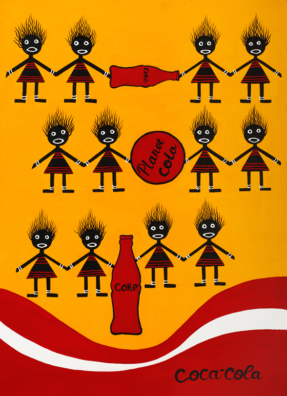
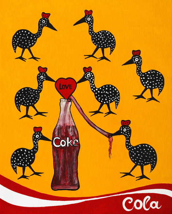
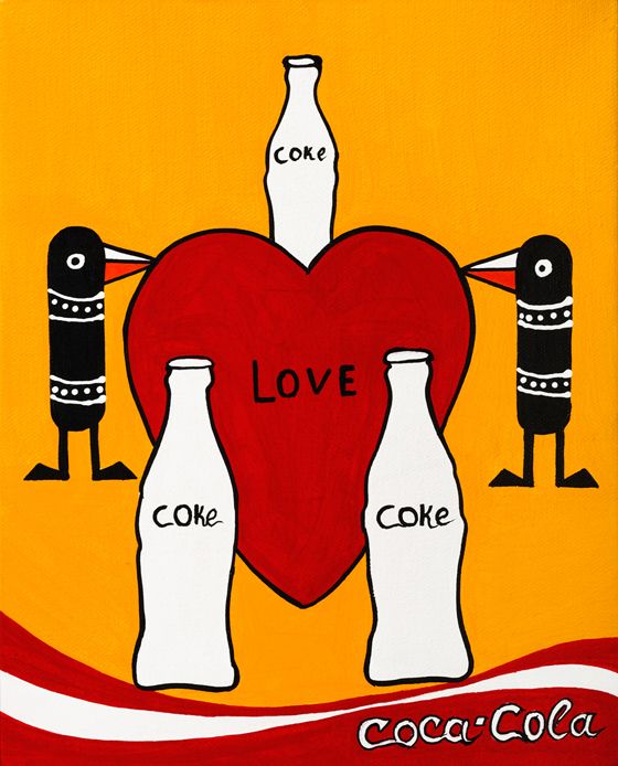
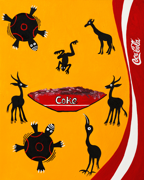
For ‘The Coke Side of Life' Remix project, Mienandi created 4 paintings in the traditional Poto-Poto style. Here you can see the original artworks.


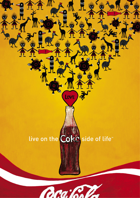
And this is the final "Coke Side of Life" poster...

Todd Alan Breland

ARTIST SPOTLIGHT


ARTIST PORTRAIT
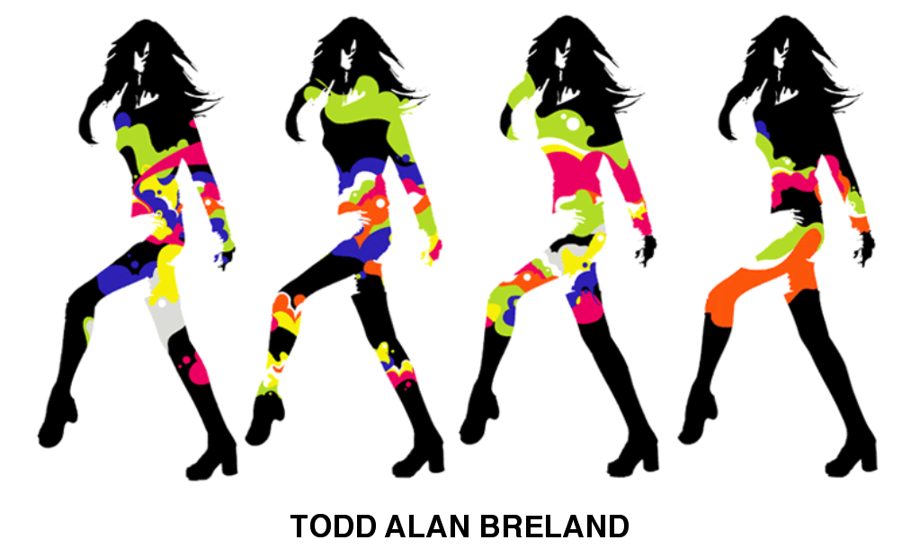
From creating his own comic books as a kid to designing skateboard graphics as a teen, Todd Alan Breland has always been an artist in heart and soul. However, he didn't know art was going to become his career. “I figured I'd just be a professional skateboarder my whole life. I began to take art more seriously when I got accepted into the Old Donation Center for the Gifted and Talented. My eyes were opened up to a broad range of mixed media : from painting and fresco to illustration. I attended advanced college level art courses in high school, but it wasn't until I moved to college that I heard the term 'graphic design’.”
After graduating from college with a BFA in Communication Arts, Todd Alan Breland worked for a handful of firms as a designer, eventually moving up to art director. Those years provided a lot of great experiences, while he learned the ins and outs of the business, working with a team and handling client interaction.
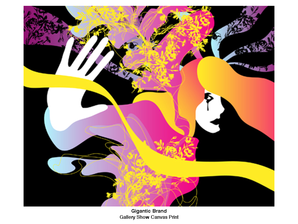
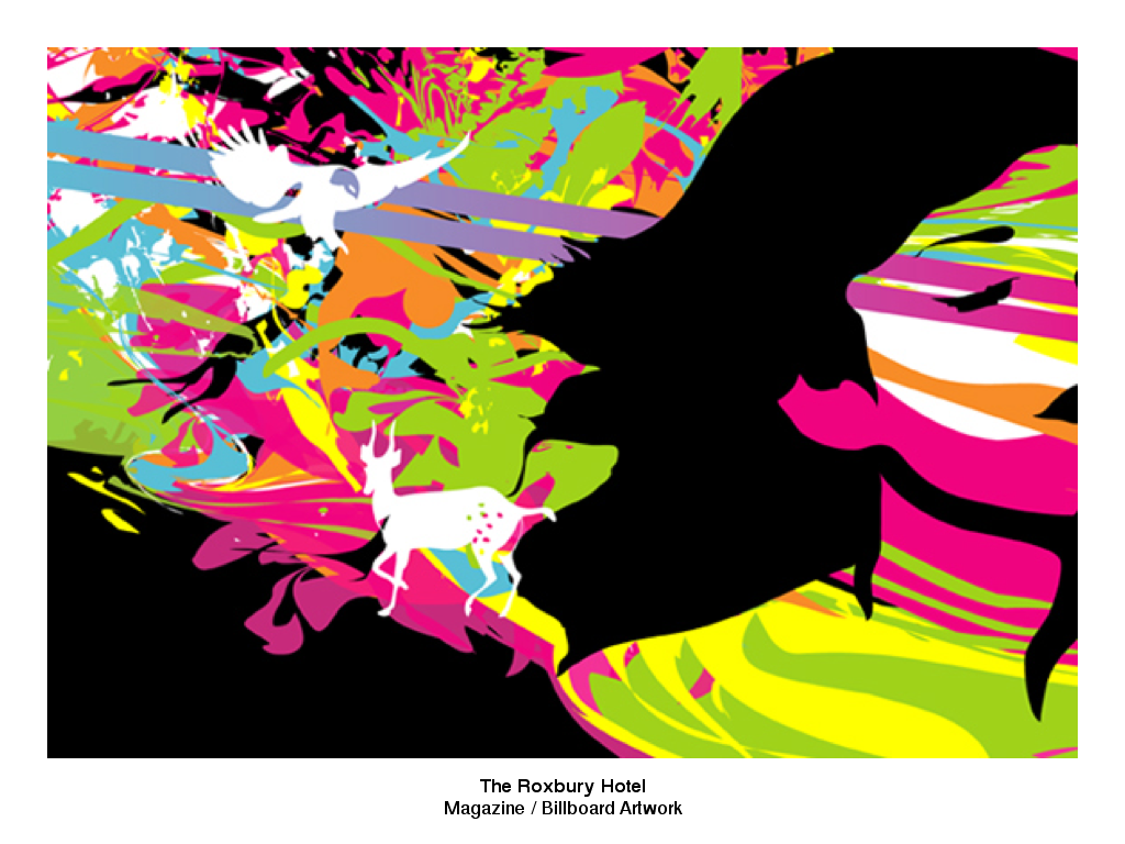
In 2004 Breland started to work as a creative consultant / art director under the moniker IMNY: “I've done it all - independent to corporate identities, branding, advertising, editorial (from newspapers to magazines to books), cd's, posters, apparel and accessories, packaging, gallery shows, art for the web, to even greeting cards.” Breland seeks to bridge the gap between 'art' and the wide world of corporate design. “I've had the pleasure of meeting and working with some of the most amazing and talented people in the industry; artists, agencies and clients alike. But it all boils down to this...simply put...I love what I do.”


INTERVIEW

HOW LONG HAVE YOU BEEN WORKING AS A DESIGNER?
I graduated from college in 2000 and immediately started working for a local newspaper. Right after, I jumped from that to a small design house and then to a larger corporate firm before going out on my own in 2004. I've been going strong solo since (knock on wood ;-)

WHAT INSPIRES YOU?
My environment as a whole really shapes my work. My friends and family, nature, our environment, everyday people, the news, the food I eat, stress, misery, happiness, … are all factors I believe. Other than that, i just have a strong sense of motivation; that amazing feeling of accomplishment when a project is finished and I'm proud of the outcome.
As far as other art/artists, I've always been a huge fan of Alphonse Mucha and Roy Lichtenstein. My love for Mucha's intricate floral illustrations and Lichtensteins bold imagery and vivid color are really the largest influences in my work.


DID IT TAKE LONG TO FIND YOUR PERSONAL STYLE?
Not particularly. I've always had my own style but early on being a designer working corporate I couldn't really express it in my work. Now that I'm on my own it’s a great feeling to be contacted for work solely because of 'my' style. I guess if I had to define my style I would call it 'pop nouveau.'
The gestural and flowing line movement of art nouveau and the silkscreen stencil work of pop mesh well in my head. I love using bright and vivid color, heavy patterns and layering. I'm fascinated with women too, as they are the subject of most of my work. I love how such a slight change in movement and curves or an expression can manipulate the entire feel of a piece.

ANY INSIGHTS IN YOUR CREATIVE PROCESS?
I think I can speak for most artists by saying, when you're feeling creative you have to go with it. Its hard to put a time on creativity. Some days I wake up and its like I've stumbled into a whole new universe. I feel innovative and I'm all over the place. Other days I can stare at a blank canvas or mess around for hours and not feel the least bit motivated. Once I do get into my work, there is no method. I usually just play and play until I feel the piece is done. I hate people seeing my work during the interim stages before it’s complete. What they see then, may look completely different 10 minutes later.

DO YOU START SKETCHING ON PAPER OR DO YOU WORK DIRECTLY ON THE COMPUTER?
I keep paper and ink pens handy on my desk because I'll go back and forth. If I don't go into a project with a concept already planned out, I'll sketch around ideas on paper until I come up with a solid direction. Most of my final artwork though is done digitally. It’s still so new to me. I'm 30 now and I didn’t have a computer at home or even in school until college, so I grew up using sketchpads, newsprint, etc for art projects.
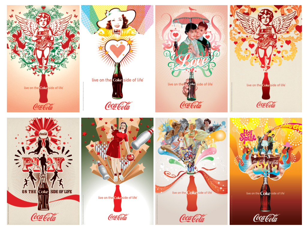
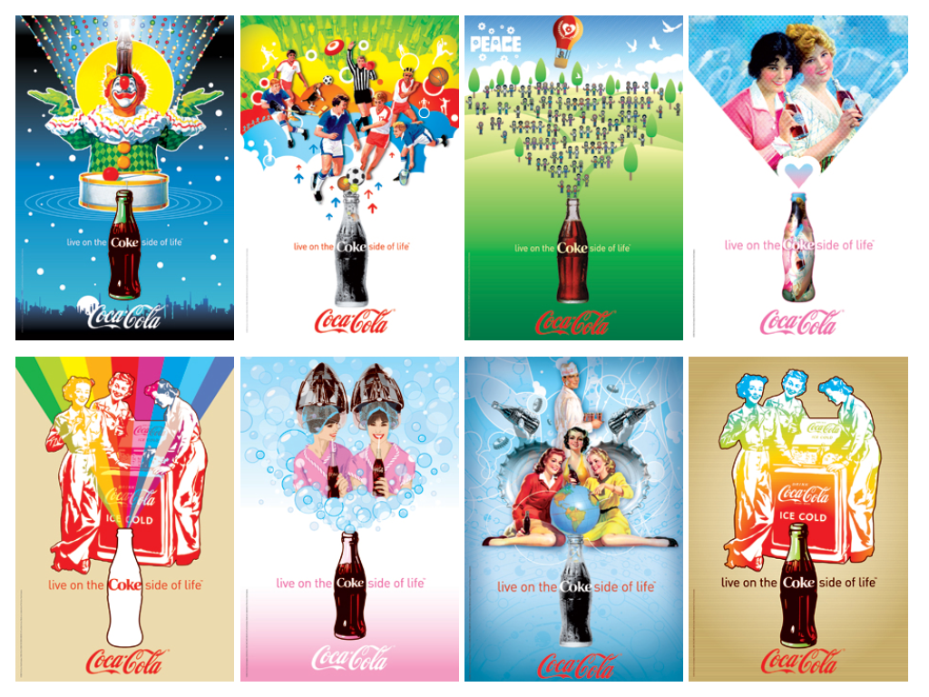
MUSIC SEEMS TO HAVE A PROMINENT ROLE IN YOUR WORK. HOW DID YOU GET INTO THAT SCENE?
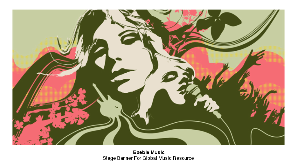
I believe it’s natural for any artist to reach out into other creative outlets. For me that was being involved in writing music and being in bands. Art, music, fashion and entertainment all go hand in hand. It’s natural for those things to intermix. I think my 'being in a band' days are over but I still love creating artwork for others.


WHAT INTERESTS YOU MOST IN ‘THE COKE SIDE OF LIFE’ REMIX PROJECT?
I think what interested me most was the global aspect, having artists with such a variety of styles from all different parts of the world working together. I was really curious to see the interpretations of each artist or agency.

HOW DID THE ‘COCA-COLA’ HISTORY AND THEMES INFLUENCE YOUR REMIX WORK?
Well there’s a constant fun, loving feeling in ‘Coca-Cola’'s advertising. It was very easy for me to reproduce that feeling because it comes so natural to me in my work. The way ‘Coke’ has been pushing art and design into mainstream marketing is incredible. I think they are one of the few large corporations that realizes how much of an impact art has in the world. Being represented by artists like Rauschenberg and Warhol is also a huge influence. Those artists were able to find that perfect balance in their work of enhancing the iconic imagery of ‘Coke’ as well as being a complete reflection of the artists personal style. I like to believe I achieved the same.

HOW DID YOU COME UP WITH THE IDEAS BEHIND YOUR POSTERS?
I wanted to avoid any thought process and just evoke feeling. A simple idea with a colorful palette that anyone can understand.

WHAT IS THE MESSAGE IN YOUR REMIX ARTWORK?
Enjoy what you're doing, always!

IS IT DIFFICULT TO COME UP WITH ARTWORKS THAT FIT A THEME?
It can be very difficult if it’s not a theme that naturally flows with the artists’ style. However I think having a graphic design background allows me to be more flexible because I'm accustomed to catering to a clients needs.

WHAT'S YOUR ULTIMATE DREAM PROJECT AS AN ARTIST?
I'm always looking to go 'bigger.' I think it’s a lot of artists' dreams to see their work at a large scale. I'm talking beyond billboards ;-)

WHAT WOULD YOU LIKE TO ACCOMPLISH AS A DESIGNER?
I'd like to use my artwork as a tool to help humanity. I recently did a pro-bono collaboration with the music industry to raise money to fight HIV/aids. I'd love to start a foundation that collaborates with all kinds of artists and creatives to do something on a more global level.

WHERE CAN WE FIND YOU WHEN YOU'RE NOT WORKING?
I wish you could find me laying in a hammock on an island. That’s where I need to be ;-)


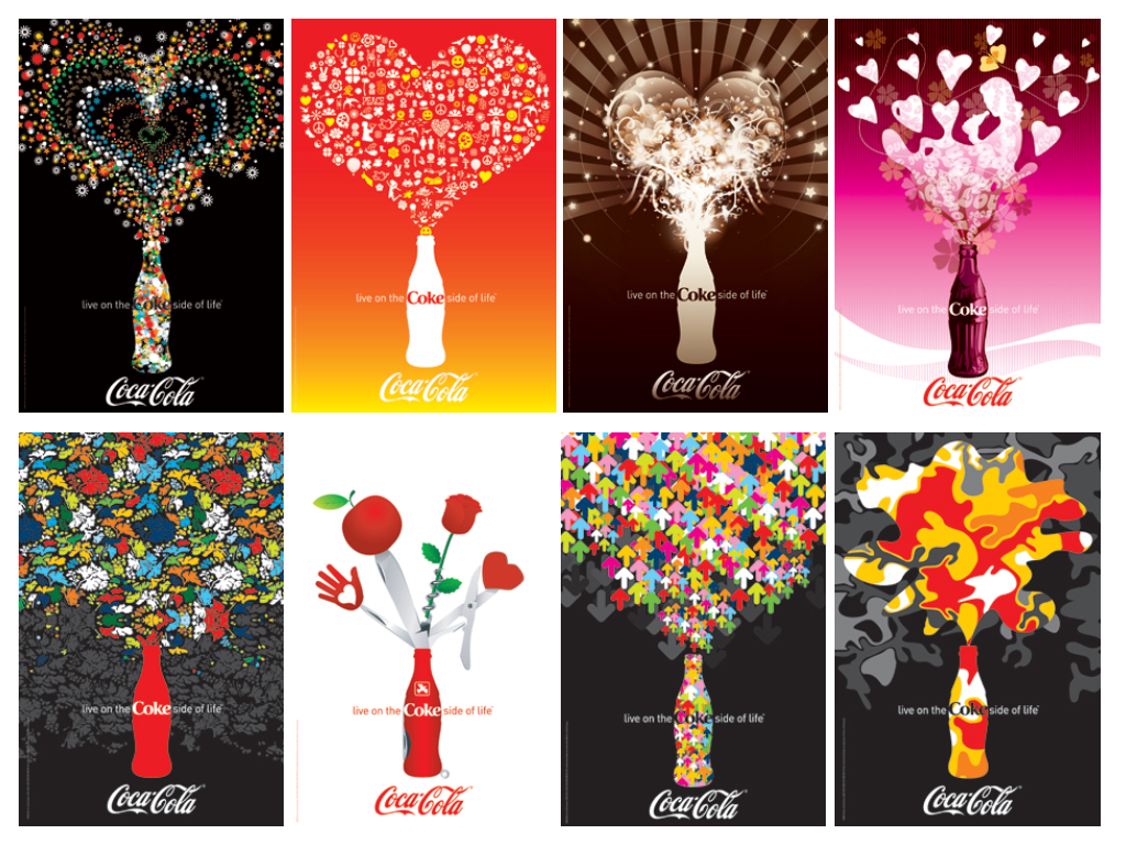
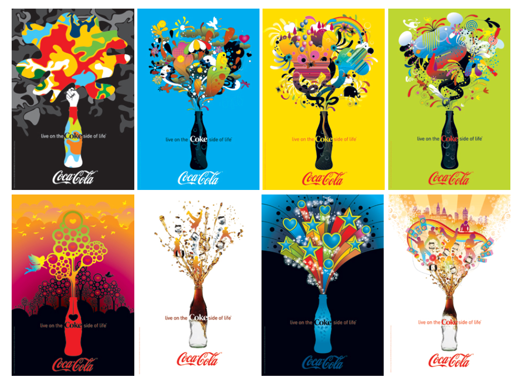
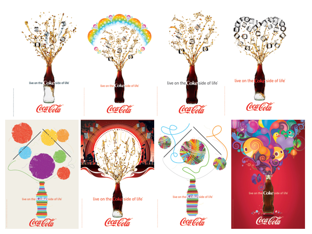
'The Coke Side Of Life' Remix

ABOUT THE PROJECT

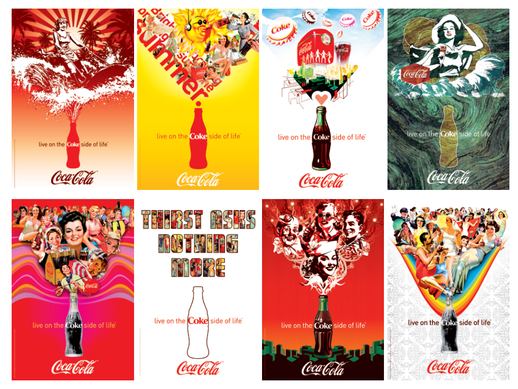
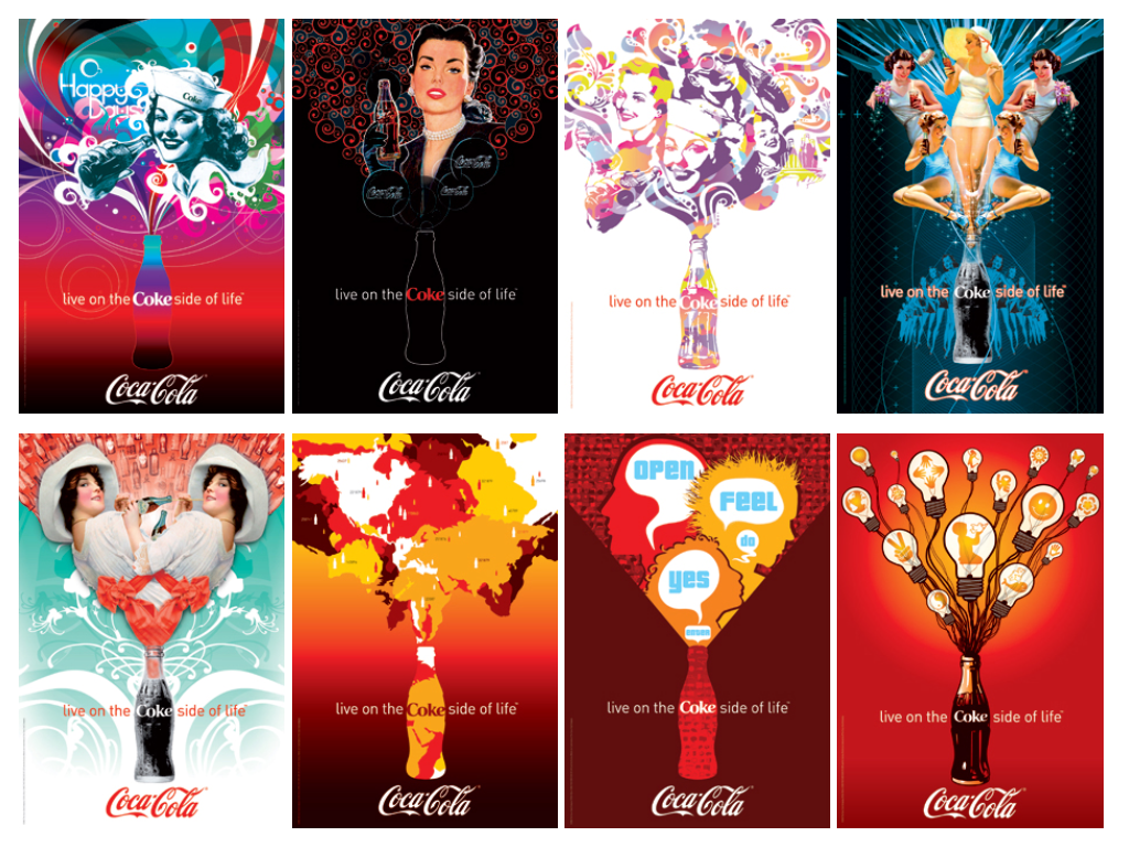
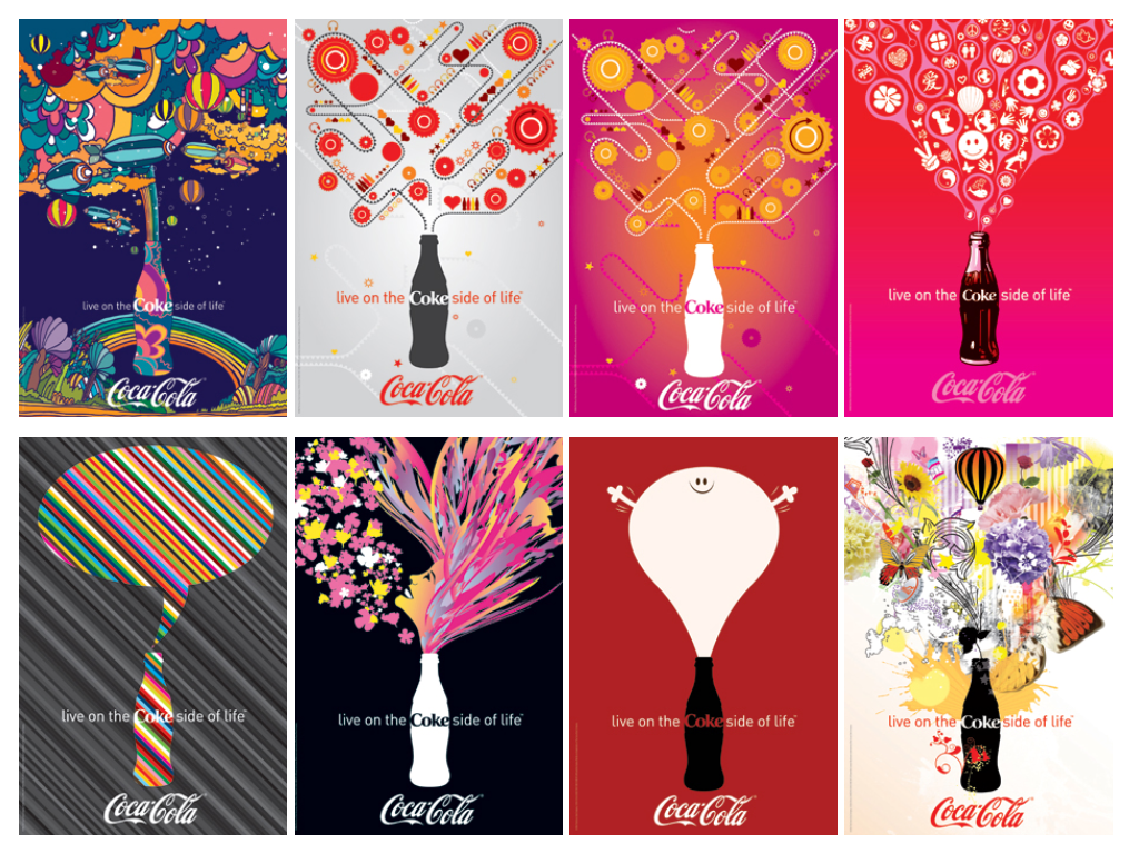
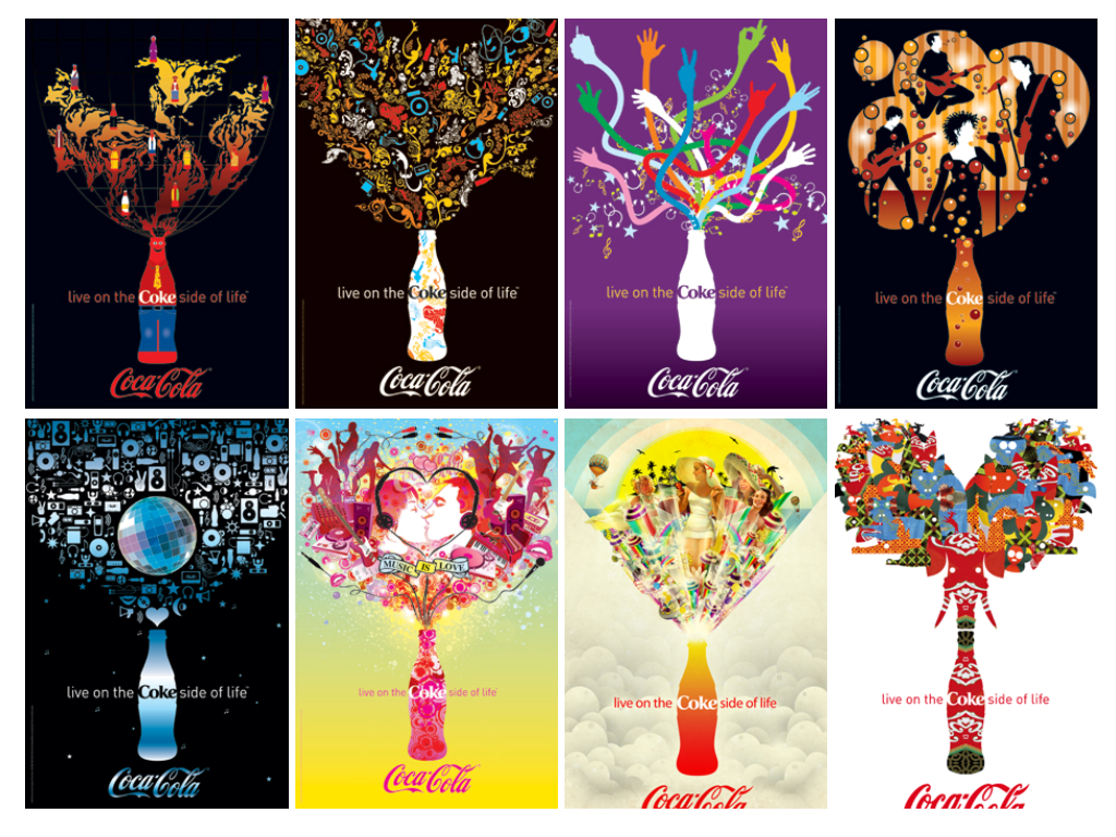
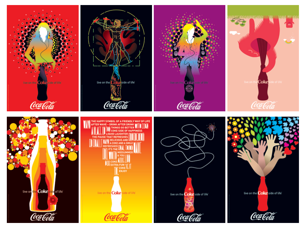
The ‘Coca-Cola’ Art Gallery is a collection of images that has been designed by leading artists and designers. They have all depicted their own interpretation of ‘The Coke Side of Life’ philosophy.

The work of the artists reflects various styles, personalities and cultures, and all designs have one thing in common: they are colourful explosions of energy, optimism and happiness.

Throughout its 120-year history, advertising and communication has played a vital role in shaping ‘Coca-Cola’ into an iconic, cultural and timeless brand. Over the years, ‘Coca-Cola’ has continually challenged artists and agencies to create innovative refreshing images.

The diverse backgrounds of the contributing artists and designers, has resulted in a range of images that reflect different cultures and societies. By combining the iconic original glass bottle image with up-to-date illustration techniques and styles, the artists have given rise to a progressive style of visual expression.

‘Coca-Cola’ has always had a strong artistic heritage having been famously interpreted by artists such as Haddon Sundblom, Norman Rockwell and Andy Warhol who have all reflected the social and cultural attitudes of the time.


Designated trademarks are the property of their respective owners. '‘Coca-Cola’', '‘Coke’', ‘The Coke Side Of Life' and the design of the '‘Coca-Cola’' Contour Bottle are registered trade marks of The ‘Coca-Cola’ Company.
Concept & Realization of ‘Coke’ Art Blog: RockAndRoll Agency ® 2007